Mobile-First E-Commerce / An Option or a Must?
Mobile is arguably the most important channel for e-commerce stores to invest in. It’s continually competing with traditional desktop browsers for user engagement and the current state of mobile technology is such that a genuine shopping experience is very possible.
Or in other words: it’s no longer an excuse to say the mobile audience isn’t there, doesn’t want it, or that mobile platforms can’t handle it.
Here are just a few facts to explain the current state of mobile e-commerce in a nutshell:
- Mobile shopping is becoming the predominant trend. By the end of this year (2021), it’s expected to exceed 50% of all online sales.
- Even on the likes of Black Friday, anywhere between 40 – 60% of sales were generated via mobile.*
- Google switched to a mobile-first index in 2019 – so even if you were banking on organic SEO strategies, your mobile site is what’s being evaluated.
*We’re mentioning this point specifically because you should always be prepared for the next Black Friday. Don’t wait until November.
Mobile-First Customers
But what do actual users want? When it comes to mobile, we can determine a number of key needs from the users’ (i.e, your potential customers’) side:
- They want to be able to buy on the go, whether its impulsive shopping or just a hectic lifestyle.
- They want to complete the entire process, from browsing to payment, entirely on their phone.
- They want a process that’s quick and painless.
- They don’t want to make sacrifices in terms of experience.
- They want to use their phone to compare prices while shopping in-store.
The biggest factor, however, is that many customers shop exclusively via mobile, while many e-commerce stores treat the platform as a secondary concern to the desktop website.
In some cases, it’s entirely possible (and does happen!) that shoppers could go to your physical stores, buy on their phone, and never use your traditional desktop website once. So in many cases, it’s less “mobile-first” and more “mobile first-and-only”.
The Many Paths to Mobile-First

There’s more than one way to enable mobile convenience. Of course, there are varying degrees of efficiency. We won’t lie, the best digital customer experience typically comes with a higher cost (in both time and other resources). Yet the overall investment is, naturally, greater at the end.
There are three basic approaches and, surprisingly, you might need more than one.
Website / Basic Responsive Design
The simplest approach is to use responsive design. That is, to utilize basic* web programming techniques – namely HTML and CSS – to adapt websites into various ‘grids’ based on the size of the respective user’s screen.
*And really, we mean basic here. Responsive design is, in many ways, the minimal baseline for an online presence in the multiexperience era. It covers desktops, laptops, tablets and smartphone devices.
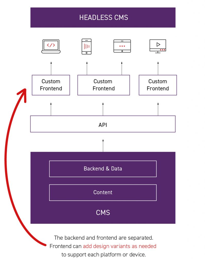
Technology-wise, a Jamstack or Headless approach (specifically with product information management and visual media) are good go-to options. These both keep things decoupled, making it easier for future expansion.
PWA / An Increasing Standard
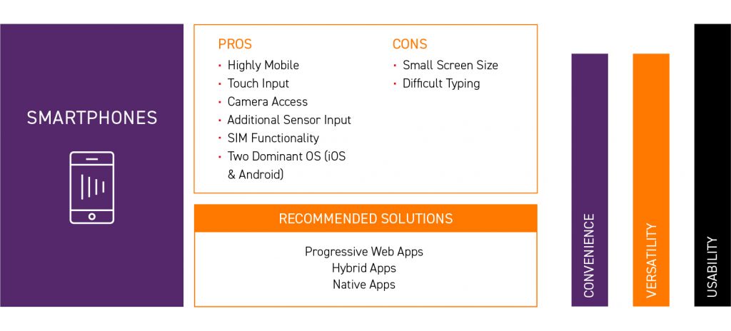
The next ‘step-up’ from a responsive website is to utilize a Progressive Web App. These are essentially downloaded from the website and act more like an app, moving from view to view rather than from page to page. It offers a faster, smoother experience – and yes, PWAs are also responsive.
This also has the added benefit that you can offer the PWA in a native-wrapper. Essentially, it will sit on your customers’ phones in the same way an app does, but it’s really just the same “app-in-browser” experience.
However, on the other hand, a PWA is a half-way house between a dedicated app (more on that in a moment) and a responsive website. PWAs offer very little benefit for desktop users. Their main strength lies in adding extra convenience for mobile users.
Dedicated App / Advanced
The ultimate solution, however, is to create a dedicated app. This is the best place to build an optimized experience, from shopping to order tracking, acting as a dedicated mobile web portal.
You also have two further options:
- Native Apps, built separately for both Android and iOS. This can make use of more advanced features… which very few e-commerce stores actually need.
- Cross-platform Apps, using cross-platform technologies (like everyone’s good friend, React Native) to create dual apps at the same time. You miss out on some native features, but web-accessibility and performance are not problems here.
However, there is one big caveat here: apps are great for existing users. New users still need to become loyal customers. They (and Google!) will be checking for your online web address first, so you still need a web-accessible platform to attract and draw people in.

If a mobile app doesn’t replace your website, then, what does it do? It encourages and nurtures loyalty. A custom app can act very similar to a web portal. It gives users a dedicated account, rewards for frequent purchasing and other incentives to stay with your store vs somewhere else.
Maximum Results / Minimal Effort
So if the ideal solution (in a perfect world) is to use both a dedicated app and a high-quality website… how do we do both without repeating workloads for no clear benefit? The answer is easy: headless.
For example, we recently discussed the nature of Headless CMS and its many benefits….

… and it’s the same with the wider world of headless architecture. We essentially create single sources of truth, from design systems to product information management, to ensure everything is accurate, everywhere. In all of these, we’re using a centralized backend that can be sent out to multiple frontends as needed. This also has the added bonus of preparing your e-commerce for expansion, should you wish to head to new markets.
Ultimately, the need to invest in mobile is clear. This year, we expect it to be contribute to an even higher share of overall sales. If there’s one channel to get right after your website, it’s mobile.


